10 Tips for painting small spaces
There is something magical about making a small apartment look bigger, and playing with paint, furniture, accessories, heights and colors can add a few visual meters to any space like a magic wand.
We have already talked about multifunctional furniture or ideas for decorating tiny spaces, so this time we are going to focus on the walls, and specifically, on the main tricks for painting small spaces.
Before we get into the nitty-gritty, when space is limited there are some general color rules you should follow. Of course every rule is there to be broken if done properly, but with these rules you can be sure you won't go wrong:
The first one is the 60-30-10 rule. This is to use the base color in 60% of the space (usually on the walls), which in this case we recommend to be in the range of light colors. A 30% will carry the secondary color (e.g. in furniture of great mass, such as a carpet or a sofa) and finally a 10% will carry the focal color, usually a little more vivid than the previous one, used in small accessories such as a pouf, a vase, etc.
The second rule is that you should forget about painting each room one color. Just as using a different floor in each bedroom "cuts" the space visually, so does a different wall color, while a homogeneous tone makes the space "continue" inward or outward, making us perceive it bigger. That doesn't mean that you can't color a wall or use any of the effects we'll see below, but in general, painting this room peach, this one pink or that one blue is out of the question.
The third rule is to try to paint the elements that go directly to the wall in the same color. The clearest case is that of radiators: painting them in the same color as the wall will blend in with it and tend to make the space larger.
And keeping these general rules in mind, let's go with some of the most suitable shades, combinations and effects of paint for small apartments.
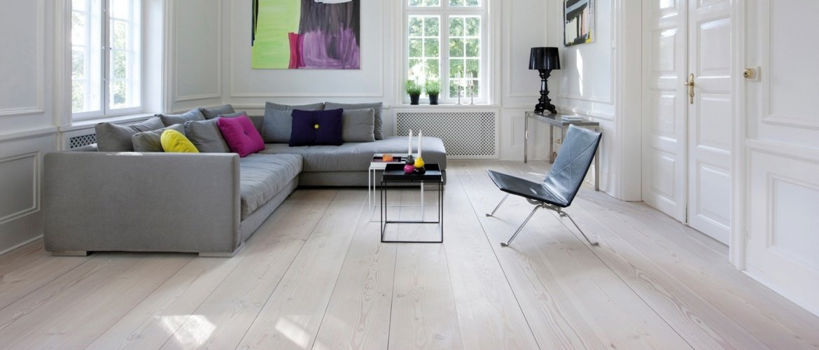
1. The target
It is usually the first choice that comes to mind, as it is the color that enlarges the space in general and reflects more luminosity. However, you must be careful when applying it, as you must avoid the "dreary effect" that it sometimes causes.


A trick to avoid this is to combine the white of the walls with the wood of the furniture, floor or blinds.


Another option, especially in small spaces with very high ceilings, is to paint the walls white but use another color or material on the ceiling.

Of course, playing with color in the accessories to contrast the white of the walls will always be a good option, especially if we opt for cheerful tones of the warm range (yellows, oranges or apple green are a perfect choice).

2. Light shades in the range of warm colors
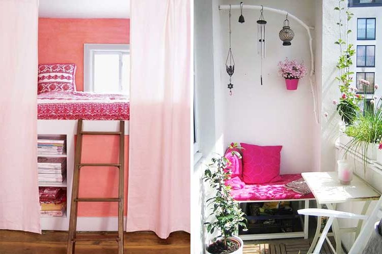
If white seems too cold or minimalist or Scandinavian styles do not suit you, try light tones that do not stray too far from white but give a little contrast to the walls, which should all be painted in the same color.
Light mink or pale pink are perfect to achieve that serene and relaxing atmosphere that visually enlarges the space, especially if you combine them with white ceilings, windows and baseboards.


3. Light shades in the cool range
If you live in a very hot environment or prefer to get a cool effect instead of cozy, certainly light tones of the cold range are your choice, such as light blue or mint green. However, be careful when applying them to avoid making the room look childish, especially in the case of blues, so typical of baby rooms.


In kitchens, you can choose to paint the entire kitchen in contrast with the white of the furniture (an option that is very fashionable, to achieve larger and more homogeneous spaces than if tile is used) or paint a specific area to match the furniture to achieve an effect of continuity.

4. Gray as a neutral shade
Light and warm tones tend to create serene environments but with a feminine touch, while cold tones add a touch of freshness, but both condition the subsequent decoration.
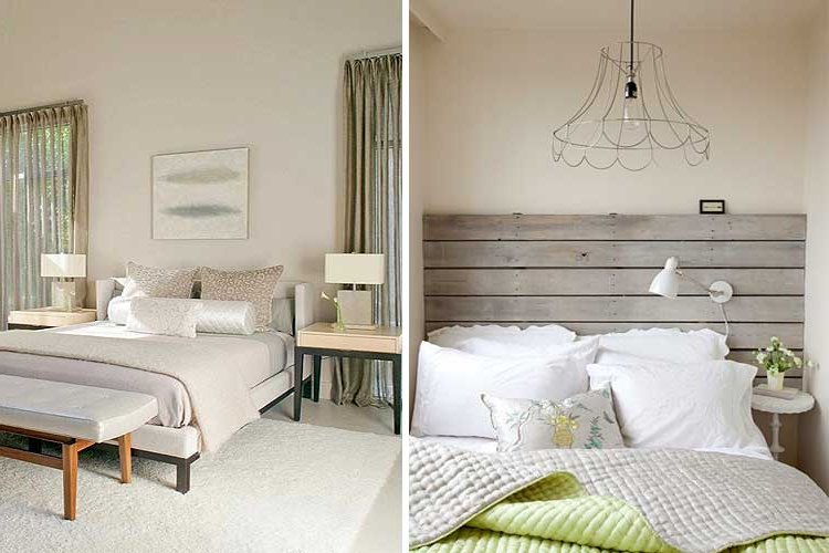
If what you are looking for instead is an environment that, without being white, is totally neutral, try the different shades of gray, although the lighter and closer to pearl gray, the larger the room will be.

However, as this color already tends to darken the rooms a little, combine it whenever possible with white in furniture, windows, doors or baseboards, to avoid an excessive presence of this color.
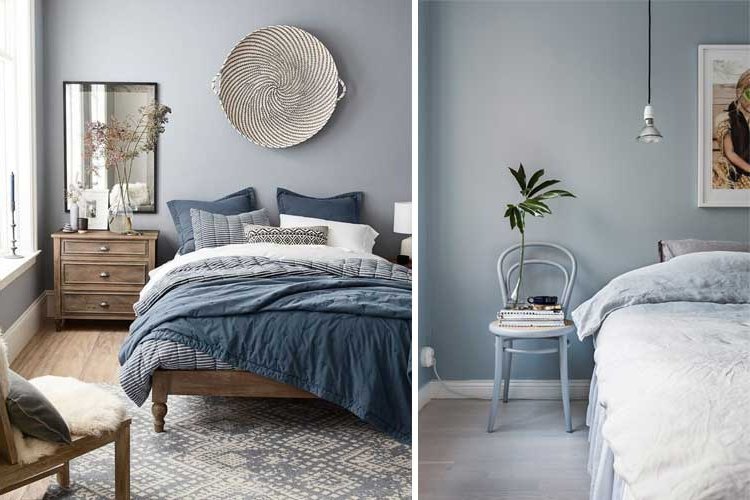
As a note, gray is particularly suitable for small bathrooms, where most of the furniture and bathroom fixtures are white. In these cases the paint will save you a few centimeters of wall tile and also, by avoiding any type of joints will create a "wraparound" effect that will make you perceive the bathroom larger.

5. Breaking the white: painting in the woodwork
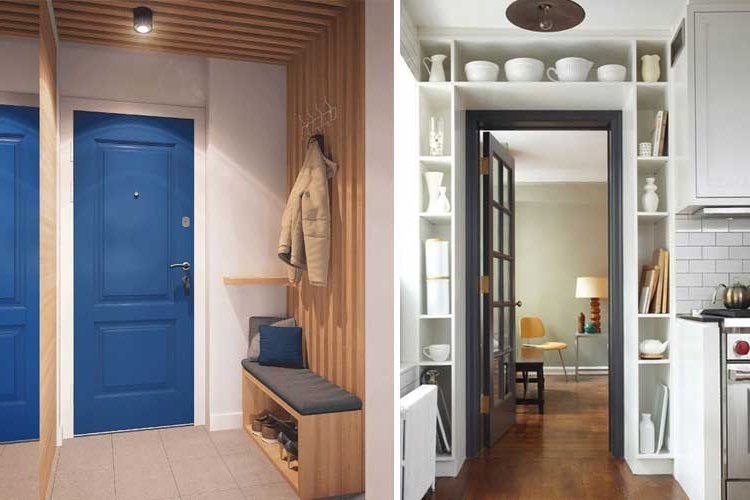
If you opt for white as the base color but want to add some color, without sticking to the typical ocher, pastel or light tones, an original and daring option is to paint the woodwork.
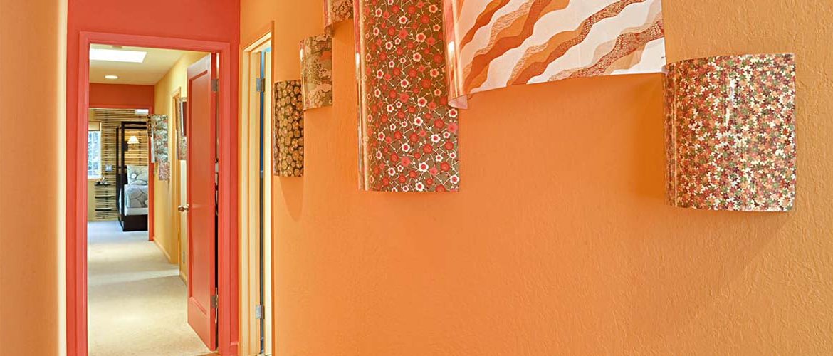
You can use yellows, fuchsias, blues or any other bright tone you like on the leaves or on the edges of doors, window frames, shutters. In this way you will achieve small but cheerful and casual environments, without giving up the spaciousness that light tones provide.


6. Breaking up the white: stripes and geometric motifs
Another option to kill the "total white" with paint is to paint on the wall a motif that breaks it. You can for example create a vertical or horizontal strip in light or dark tones taking advantage of the placement of certain furniture (dressers, shelves, tables). This will help you to mark areas and avoid the dull effect of a completely white room.
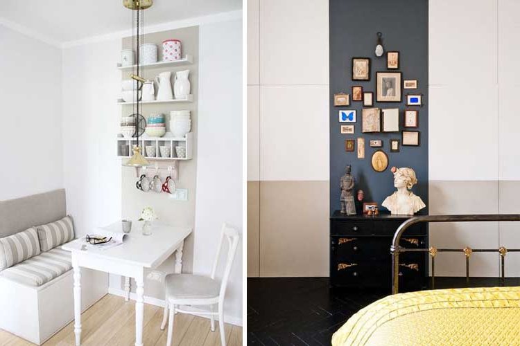

This option is also widely used in bed headboards, as the paint saves space (those 5-10cm that occupies a headboard) but at the same time perfectly marks the sleeping area.

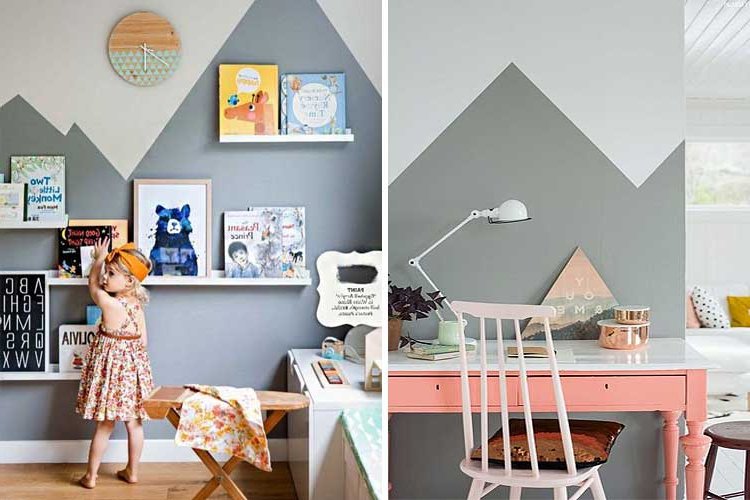
Finally, a more daring option is to design geometric motifs, such as diamonds, triangles or a combination of them. If the tone chosen tends to be dark, use it in the lower area of the wall so that it does not weigh too much.
7. Combining colors: Cut effect
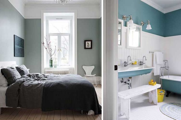
Double painting on walls through lower or upper strips or baseboards is widely used when ceilings are very high, to avoid the "tube effect" caused by tall, narrow rooms.
This allows to "shorten" the ceiling and enlarge the width of the spaces. However, in these cases the strip must surround the entire room or the effect will be lost.

8. Combining colors: Gradient effect
In small spaces it is essential to achieve not only spatial visibility but also environments where serenity prevails, as this is also psychologically associated with greater amplitude. A very interesting option in this regard if you want to use more than one color, is to opt for gradient painting, in which the boundaries between one and other tones are mixed to get the most original and colorful walls without losing amplitude.
However, in these cases, we give you the following advice:
If the gradient is from any tone to white, you can afford to choose a bright tone in the lower area (ideally one third), leaving the other two thirds of the upper wall white.

If instead you are mixing complementary tones (e.g. blue with orange, green with pink) that do not evolve to white but blend into each other, we advise you to opt for pastel tones, whose transition is much smoother.

9. Combining colors: marking areas
In small apartments it is common for different areas to share space: kitchens open to the living room, bedrooms separated from the living room by a simple bookshelf... In these cases, we recommend marking the different areas with a colored area. This will visually create a perception of "separate rooms" that will make the overall space feel larger.

10. Point effects: how to add depth
Paint can also be used to add or eliminate depth between different areas, lengthening or shortening the areas or walls that we see in the background. That is to say, even if our apartment is large, we may have a smaller area, a corridor that is too long or a narrow room that we want to enlarge.
For these cases, paint is a perfect ally, as it allows us to play with tones and shapes that the furniture does not allow.
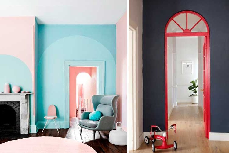
The most classic example is to paint the back wall in a darker color to "bring it closer" to the view, typical of narrow and elongated rooms, although another more original option is to mark with paint the access between two rooms to separate them visually.


If instead you have a very long hallway painted in white and you want to mitigate that elongated effect, you can paint the doors in a contrasting tone or draw in dark tone some shape on the wall that is free.

Another more risky and fun way to add depth to a small space is to combine two colors on different wall planes. For example, a dark wall that leads into a white wall or a wall of one color that leads into a room of the opposite color will achieve a very interesting "depth effect" that will make the background area longer.
As you can see, not everything is reduced to white. If you have a small apartment, there are many options to play with spaces through paint and we hope we have been able to transmit you some good ideas, it's all a matter of imagination, knowledge of visual perception, good industrial paints for professionals and a good brush! :)


