Paint color trends not to be missed
Turning your interiors into scenarios worthy of any decorating magazine is easier than you think. Following color trends is a good first step, not in vain, the chromatic palette is a tool with enormous potential to transform spaces. Although neutral tones with small nuances are a safe bet, as every season, experts bet on color to give rooms a unique character.
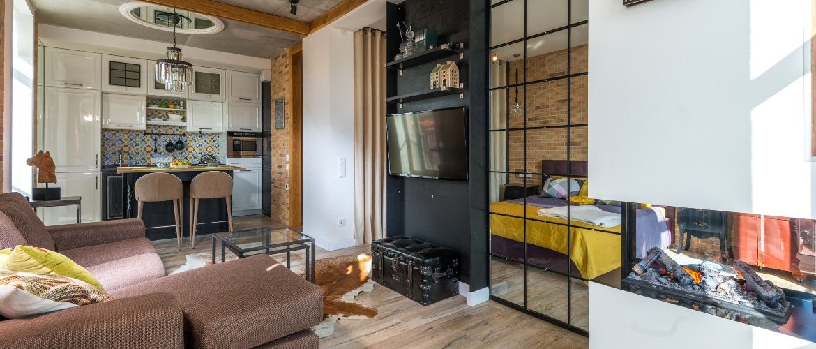
This year's color trends offer a wide range of options from green to powder pink, earth tones, grays or blues. Pure inspiration for all tastes
The options are very varied and, beyond the walls, it is advisable to rely on other elements of the room to create a chromatic amalgam that awakens the senses. Colorful furniture, accessories, textiles and even plants can become great allies to fill the home with color.
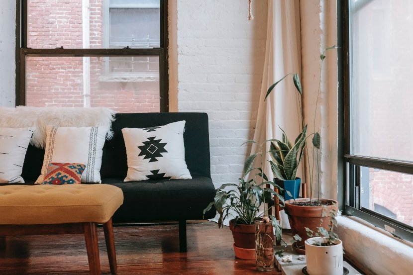
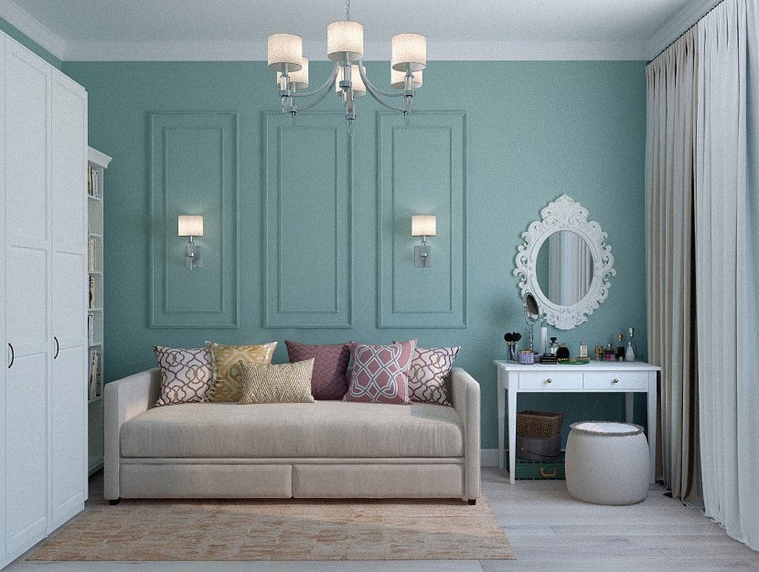
Green is one of the trend colors this season. It denotes serenity but also freshness and is undoubtedly a tone that connects us directly with nature. The palette, in any case, offers a wide variety of shades. This year, some are protagonists such as emerald green, ideal for sophisticated environments, and others more vibrant such as lime green, capable of flooding any space with vitality.
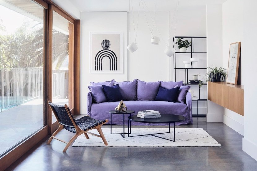
To talk about color trends is to talk about Pantone and, as every year, it launches its particular bet for the season. The experts at the Pantone Color Institute have chosen Very Peri as the color of the year 2022. This tone represents the perfect fusion between the tranquility of blue and the energy of red.
The result is a purplish hue that both experts and the average person will love. Does it seem too risky for the walls? Then try including it in the accessories - there are many possible combinations!
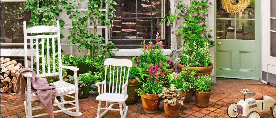
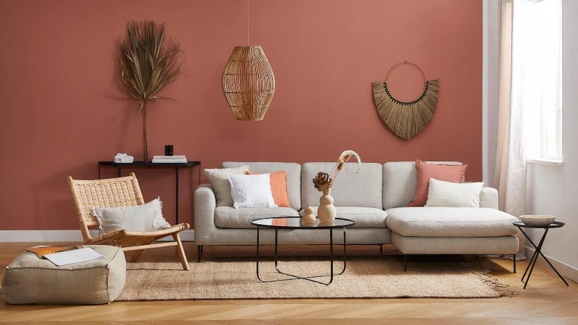
The connection with nature continues to mark a good part of the decorative proposals and the color trends do not escape this influence that tinges the spaces with terracotta, greens and warm tones.
Warm, relaxed and very natural. So are the rooms that dress their walls in terracotta color, a tone that, like green, connects with nature providing an undeniable personality to the spaces. If you want a successful result, combine it with other earth tones as well as with complements of natural materials and fibers.
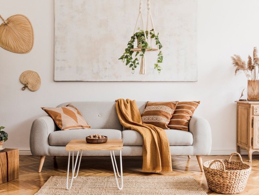
In addition to terracotta, colors such as chocolate brown, camel or sand tones are among the preferred colors for walls. They are synonymous with warmth but also with naturalness and, consequently, create the most welcoming atmospheres. But if intensity is your thing, you can also go for mustard, oranges and even yellow.
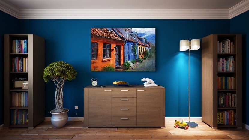
Color trends for 2022 reserve a prominent place for the blue range. Some experts are betting on soft and muted tones or blues with grayish shades for atmospheres that exude serenity. However, petrol blue, which has been the protagonist for some seasons now, is making its way into interior design, dressing not only the walls, but also the most elegant accessories and upholstery.
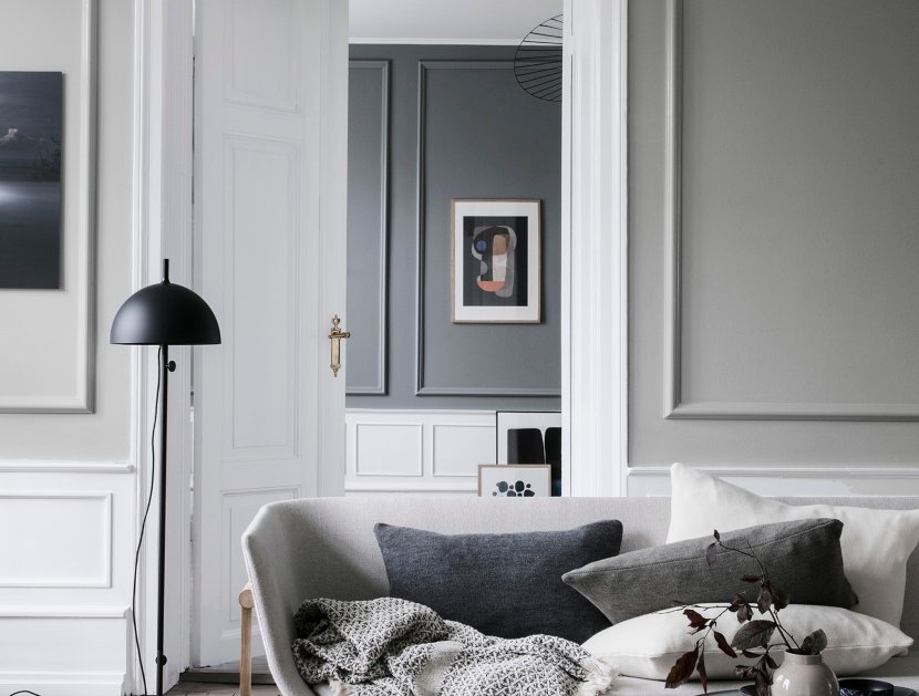
There are those who believe that gray is a boring shade. However, its presence in interiors brings an undeniable elegance, not to mention the fact that it is one of the trend colors. As part of the catalog of neutral tones, it is perfect for maximizing spatial perception and, together with Pantone's snow white, it is gaining in popularity this season.
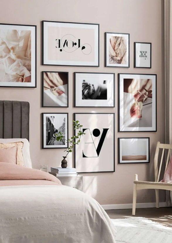
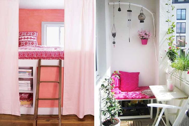
It was one of the protagonists last year, but powder pink continues to be one of the season's favorites. Its multiple denominations are just an example of the versatility of this tone that triumphs again expanding the range. If you wanted to include it in the decoration of your home, take advantage because this year you can choose not only the nude or pastel version but also more intense varieties such as strawberry, fuchsia or magenta.
