Linear design in wall decoration
Wall decoration is one of the most common headaches when it comes to dressing the house, so today we dedicate the post to one of the simplest, most economical, aesthetic and most fashionable ways to do it: the linear design.

When you find a bare wall it becomes almost irresistible not to want to hang something on them to give a sense, a prominence and that touch that at first glance makes you say wow! both you and your guests.
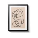
Although in this blog we have already touched on different ways to do it (with hats, with paint, with wallpaper ...), the usual thing is to hang one or more pictures, and in that sense the linear design is perfect, because in its simplest form usually comes in sheet format (although not only as you will see in this post).
In case you have not heard of it, here we tell you what it is, how you can use it and some decoration and interior design tips that will make you integrate this minimalist and simple art in your home.

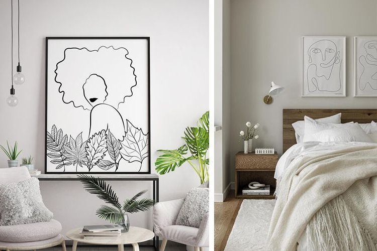
The linear design is based on Mies Van der Rohe's idea of "less is more", which tries to opt for light decorative elements that do not overload the environment.
Very characteristic of the Nordic style, the linear design imitates the human form through strokes or unfinished lines.
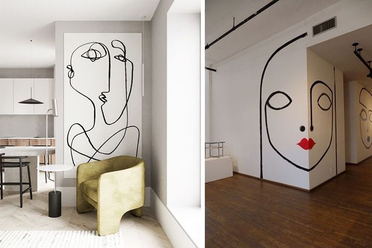
His figures can be full body or only a part (mainly the face) and he has the works of Pablo Picasso as his main source of inspiration.
The atmosphere it produces invites calm and relaxation, so typical of the minimalist trend.


Want to see ideas for decorating walls with this type of art? Well, here we go!
Grouped sheets
You can choose to compose several sheets in an orderly and aligned way, or place them in a more crazy way, the decision is up to you.


Painting protagonist
If you are of a daring nature we show you another incredible way to captivate every person who steps into your home with linear design.
In this case, the idea is to use the walls as a canvas, turning the linear design into art. The wall is the protagonist of your interior space, so if you dare, a little paint and brush in hand is enough to give style and authenticity to that space waiting to be renovated.
In addition, this way you avoid having to frame plates or try to decorate the space with many other complements, since this one speaks for all the others.

Wall murals and wallpapers
Filling an entire wall with multiple linear designs is another striking way to decorate a space.
This is often done with wallpapers that transform and eliminate any hint of boredom in your kitchen, bathroom, bedroom or any space in your home.
Ideal for those who wish to transform a lifeless home into one that is bold, dynamic and full of movement.
However, as it has a lot of drawing, care must be taken when installing it, so that every line fits perfectly.

This type of paper, besides being eye-catching, gives a lot of personality to the environment.
They look good in any space, from a living room to a bathroom, although in the latter case the paper must have a special composition to resist water vapor and not to rise.

Wallpaper is used to highlight a space and since its function is to accentuate a wall seen from several angles, it should not be placed on all of them but only on a focal point (the wall of a dining room, a headboard...).

In addition to personality, this type of mural brings luminosity and depth to the space, especially when the line is marked in light grays.
If you thought pattern repetition or information-saturated prints would look bad, here are examples to inspire you and break that fear.


Are you a color lover? Wait, there are options for you too! If whites and grays don't suit you, there are also options to vary and add color.
You can choose to add color to the background (leaving white for the line) or opt for loose patches of color on which to place the design.


Special corners
Sometimes we have at home spaces, walls or corners without a specific use, somewhat abandoned and that can be boring for the lack of that special touch.
But....if you are one of those people who cares about even the smallest detail and give sense to every corner, use the linear design and you will see how it transforms :)


Sometimes the corners are forgotten because of the lack of decorative complements or because we focus on the main areas of the house, but a simple and economical way to give them life is to complement the space with a linear design painting.
Here are some examples that will make you revive those little unused corners. That small change will make this will start to be your favorite space.



Galleries
Gallery walls based on linear design are very decorative and give a feeling of spaciousness and height depending on the order and direction in which the sheets are placed.
These can be hung on the wall or supported on continuous shelves or directly on the floor.
But in addition to these features, they will also allow you to create a tidy, organized space, almost like an art gallery.


Bonus
If you are attracted to linear design, would you dare to transfer it to an object?
This type of art is not only focused on walls, but you can also use it on decorative objects and design any accessory with them: sideboards, cushions, vases, flowerpots... even bathtubs!
Here are some ideas to inspire you and dare to take a step further into the unknown and unique. Creativity to the power!


As you can see, there are thousands of possibilities that line art offers you to generate radical and unique changes in your home.

