An updated workspace
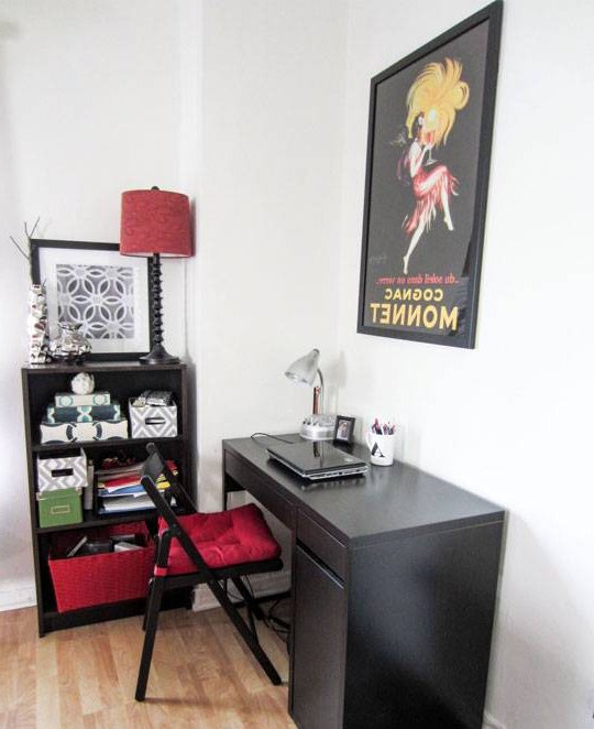
There are corners in our homes that are projected as something temporary and over time we get used to them and do not change them. This is the case of this work corner. The distribution of the black furniture in the space and the combination of colors makes the corner monotonous and uninspiring.

How to change the desktop area
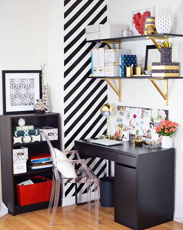
The work area consisted of the basic elements: desk, bookshelf, chair, flexo and poster. The range of colors, although successful, was finally boring and unmotivating, so the owner decided to make some changes without giving up the two main pieces of furniture, the desk and the bookshelf.
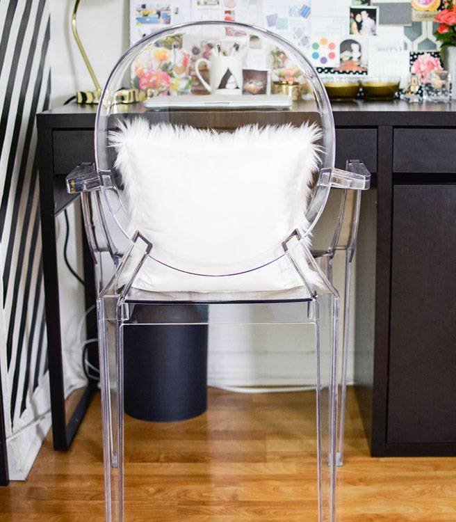
The first thing was to change the folding chair for a transparent chair, specifically the ghost model. On it will rest a fun cushion of hair.
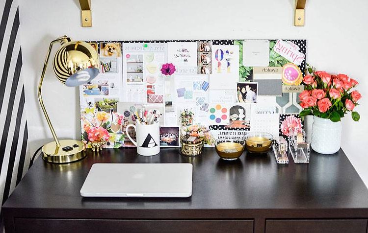
The next element eliminated was the framed poster. It was changed to a board on which to leave important and very visual notes and clippings.
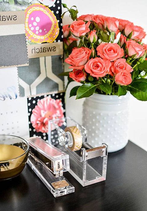
On the desk various objects that will help to maintain order and of course a bouquet of fresh roses.
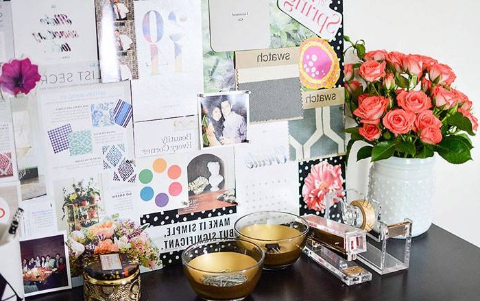
One of the details that I liked the most was the stapler and the accessory to keep the tape, which has been replaced by golden washi tape.
This is the final image of the work area. Normal shelves that have been transformed to give it a more elegant touch. To disguise the column instead of trying to hide it, the idea of giving it more prominence has been a success. A wallpaper of oblique stripes with the combination of black and white has achieved this effect. The shelving has been tidied up and the same boxes have been kept, but the overall look is different.
How do you like it best?
