Discover the 60/30/10 rule for decorating your home
One of the main problems when decorating the house has to do with the combination of colors. Once the tones have been chosen, it is time to apply them, but doing it in the right measure is not always easy. Too much or too little can be fatal to the appeal of any room. However, there are certain decorator's tricks that can help with the task. The 60/30/10 rule is just that, an easy guide to help you combine colors harmoniously.
Choosing the right colors for a room is not an easy task, but the 60/30/10 rule for decorating the house can become a great ally, at least as far as proportions are concerned.
Although it is not necessary to comply with it 100%, it is advisable to take it into account when distributing the amount of color needed in each case. According to this rule of decoration, it is about choosing three colors that will be the ones that stand out the most in the room. The quantities (60/30/10) determine the proportion in which each of them will be present.
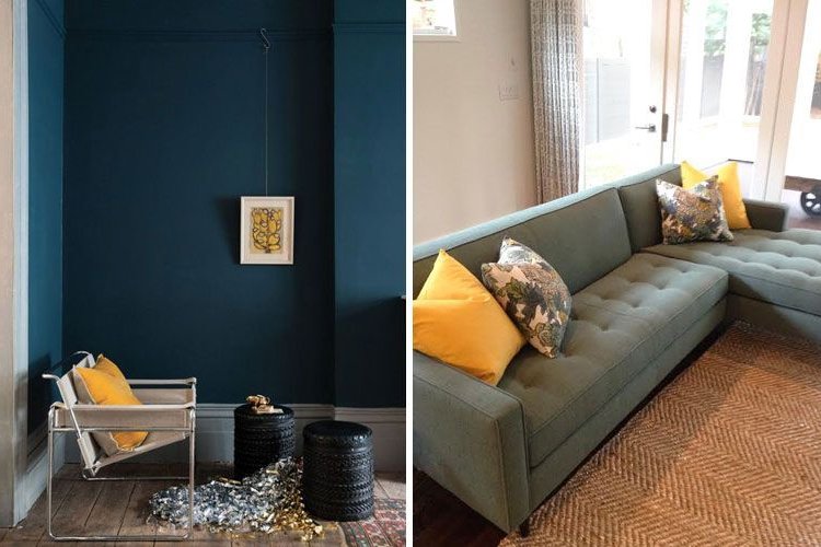
The dominant or main tone will be applied in 60% of the space while the secondary will occupy 30%. The remaining 10% of the proportion will be for the third color that will be used to add chromatic nuances as an accent.
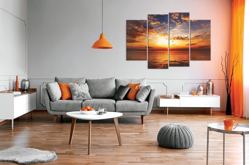
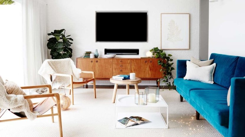
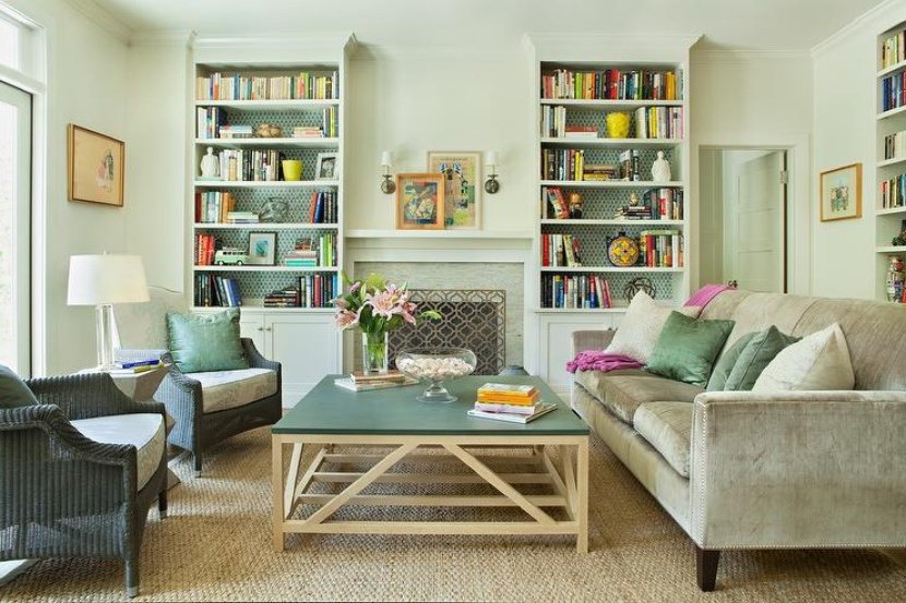
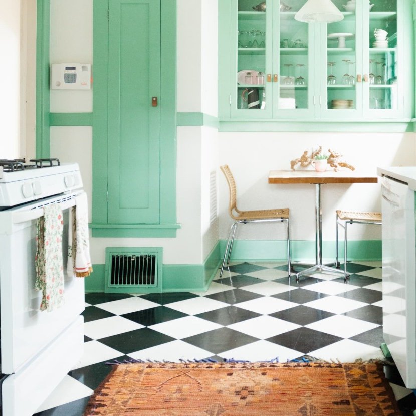
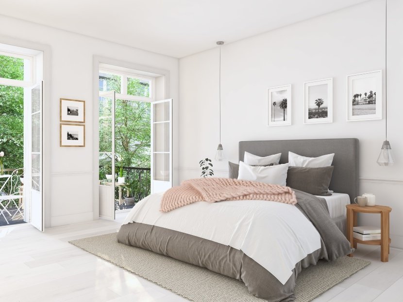
To discover in detail the 60/30/10 rule for decorating the house, we must begin by talking about colors. The 60% of any scene corresponds to the dominant or main color, which, in practice, is the one that covers more than half of the panoramic view of any room. It does not have to be the one that attracts the most attention (in fact it usually does not), but it will be the one with the greatest presence.
Generally, this tone is the one that dresses the walls, although it can be used in other parts of the room as long as its presence represents 60% of the chromatic bet.
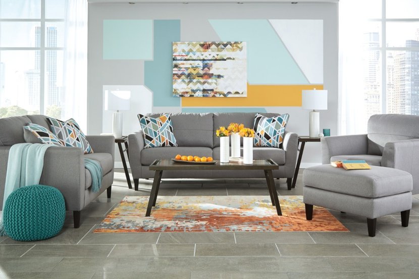
Within the 60/30/10 rule, the secondary color would be the one that arouses the observer's interest. Despite occupying only 30% of the scene, its presence imprints personality to the whole. Contrary to the dominant tone, it is not usually found on the walls, but it is usually used in the furniture.
In any case, and given that its presence should reach more than a quarter of the scene, it can also be used in textiles. Carpets, curtains and the like can become great allies to put that chromatic counterpoint to decorate the house.
The decorating rule we are dealing with is completed by what is known as accent color. It is about putting the finishing touch to any room and, for this, the 60/30/10 rule bets on chromatic nuances.
This touch of color can take the form of a myriad of details. An original vase, a floor lamp, a painting, a few cushions... Since these types of shades appear in small quantities, it is not unusual to find several accent colors in the same setting, but always prioritizing one over the others.
The theory is clear. But putting the 60/30/10 rule into practice is not always easy. Apart from complying with the proportion, the choice of colors can cause more than one headache. The essential thing is to always seek the harmony of the whole.
Turning the secondary color into the protagonist, for example, is a common occurrence. It doesn't matter if you choose a very powerful tone as a secondary color. The key is to achieve balance. To achieve it, you will have to compensate the power of that choice by opting for neutral or softer tones in the rest of the proportions.
The same goes for accent colors. It is the small details that will allow you to add these chromatic nuances so that you do not have to limit yourself to a single choice.
In any case, if once applied in the proportion marked by the 60/30/10 rule you do not get the desired results, you can always replace them with others. Surely you will find the task easier than if you are not convinced by the secondary or main color.
It is true that the 60/30/10 rule will help you to find the harmonious proportions in terms of color but it can do little to help you with the chromatic choice.
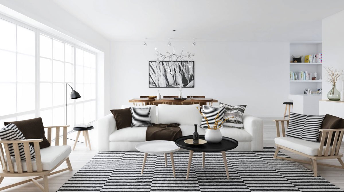
However, there are combinations that never fail. White as the dominant tone, for example, opens up a universe of possibilities. It is perfect to combine with neutral tones but also with wood and, in any case, it admits all kinds of chromatic shades.
Ready to put the 60/30/10 rule into practice? To the conquest of color!
 Tyler Wilson
 - 2.8K views