Curious ideas: How to decorate woodwork and walls with paint of the same color
In interior design it usually happens like in fashion: although everything has been invented, from time to time trends emerge that are based on "something" previous but treated in a different way, which makes them look like something new.
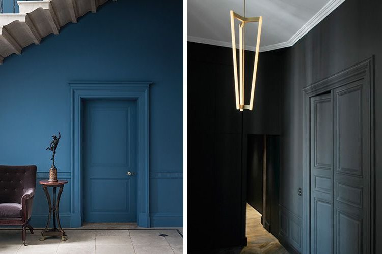
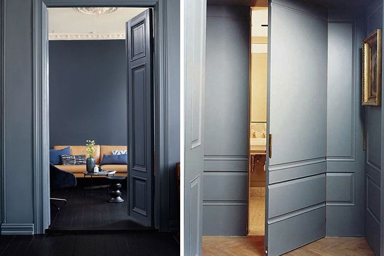
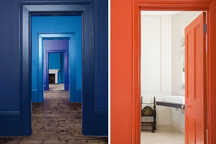
In this case, something as simple as the painting of walls, doors or furniture, are combined by matching them together to create very curious, original and trend-setting decorative effects.
Walls and doors
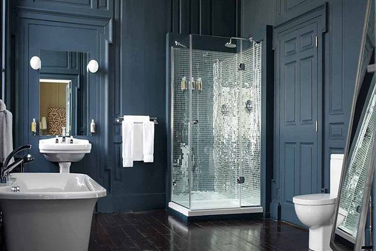
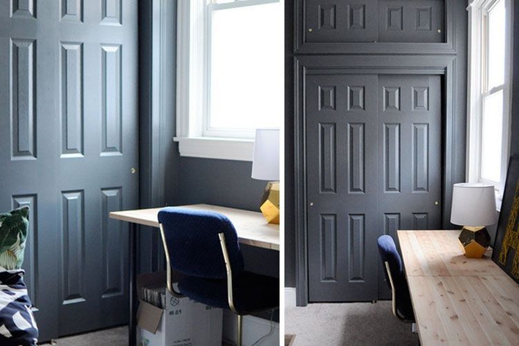
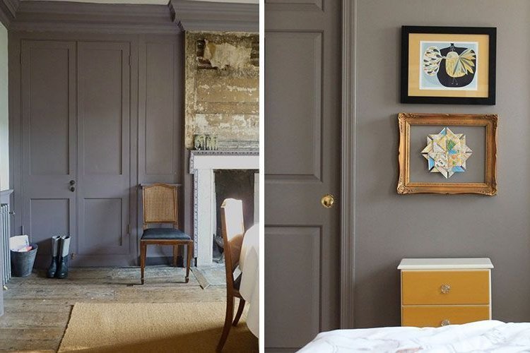
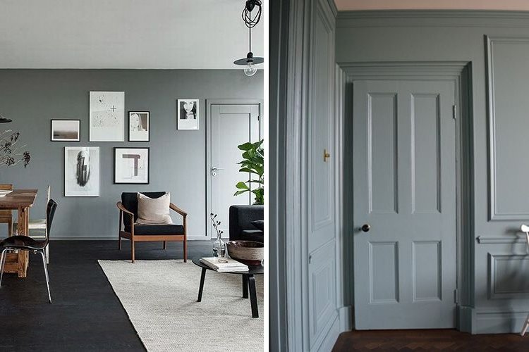
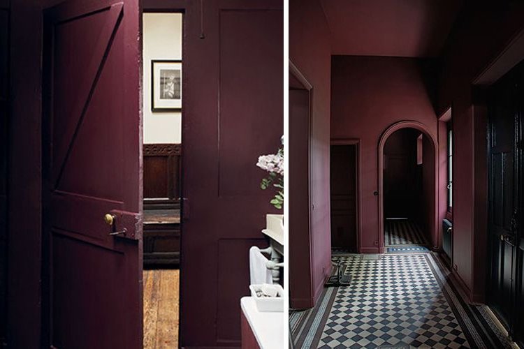
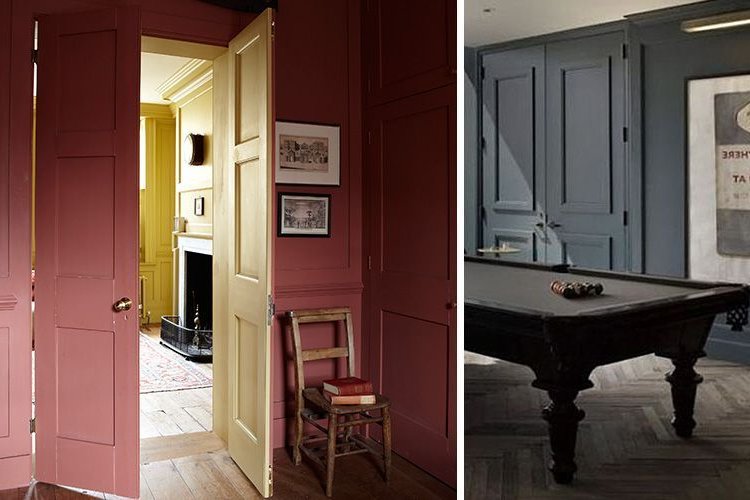
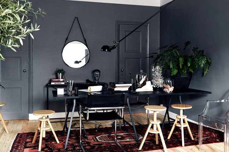
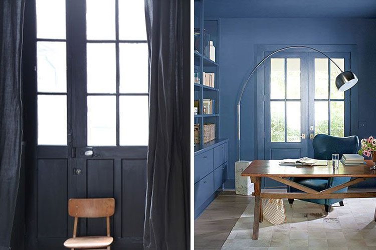
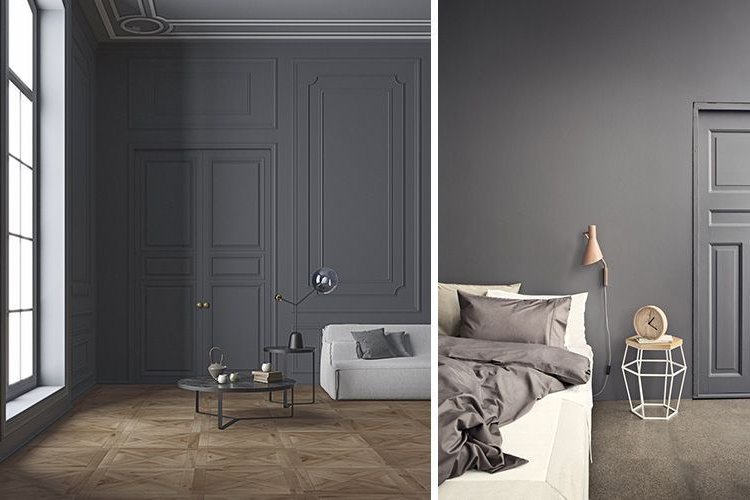
Painting the walls and doors of the same room homogeneously creates a homogeneous effect that amplifies the space and allows furniture to stand out, acting as a sort of theatrical backdrop.
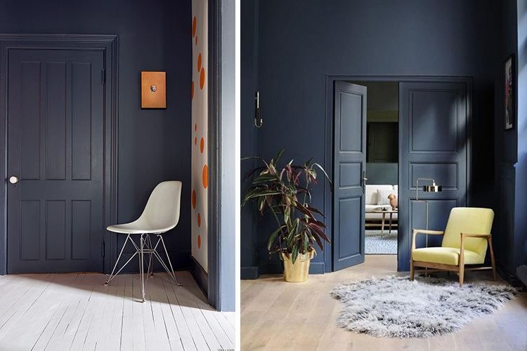
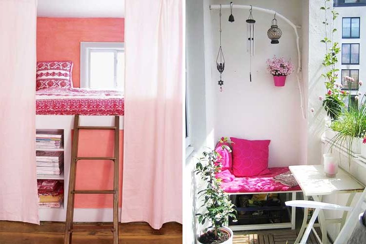
Although both light and dark colors can be used, the latter will make the furniture stand out more, while the use of light or pastel colors will give more overall brightness to the room.
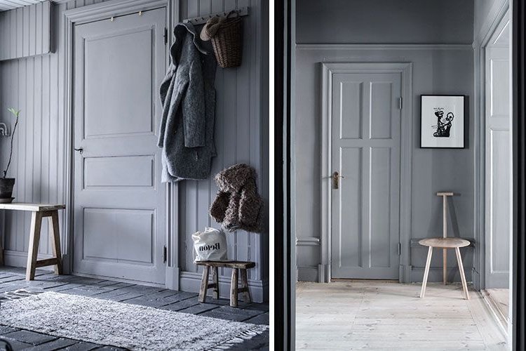
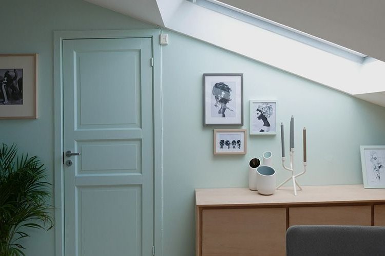
In this case it must be taken into account that for a door to look good and last it is better to paint it with enamel paint (which has a slightly satin look) than with the usual plastic paint, so if the color difference is appreciable, you can consider painting all the walls with synthetic enamel and thus match aesthetics and appearance.
Furniture and walls
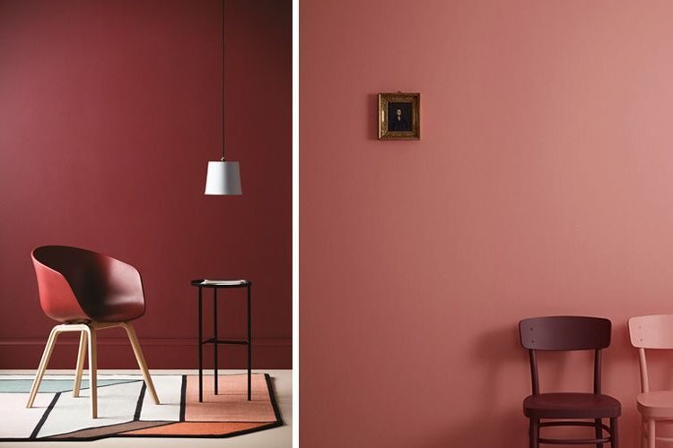
Another option within the same idea is to use the same type of paint on the walls and furniture that will decorate the space.
In this case, it is the opposite of the previous case: that the furniture does not stand out but blurs with the outline, so as to create the effect of a large and homogeneous space.
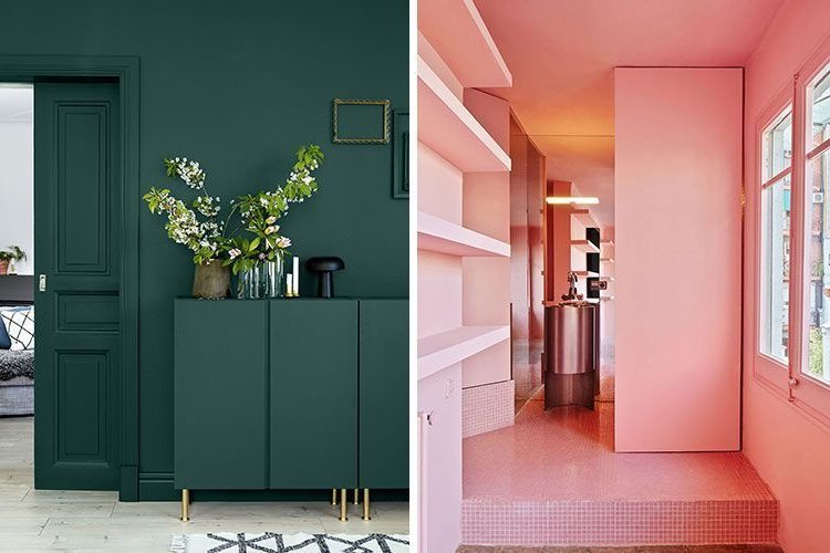
Actually, what is usually used for furniture is lacquer instead of paint, (especially if you want to give a quality appearance), so in that case it will be necessary to take into account that the chosen shade is the same and that both are available in their corresponding color charts (furniture is usually lacquered based on the RAL chart, while for paint the universal NCS chart is usually used).
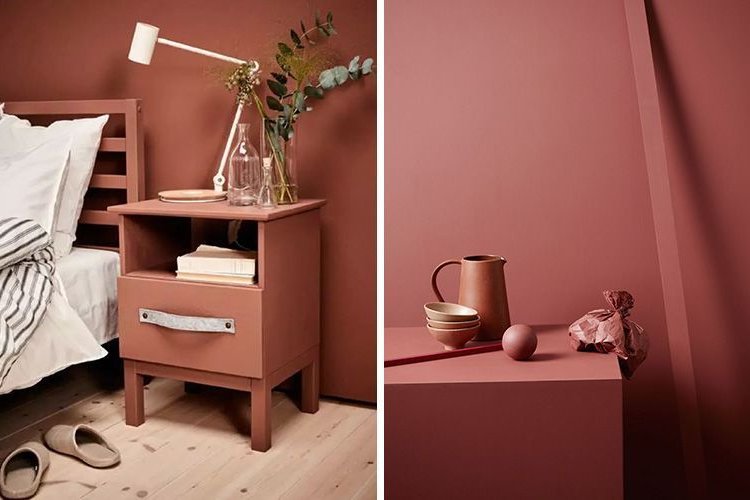

Another option is to choose furniture or accessories that already come "standard" lacquered or upholstered in a certain color and from there choose the shade of the wall (a good painter can get you the right mix to resemble as closely as possible to any sample of fabric or tone that you give him).
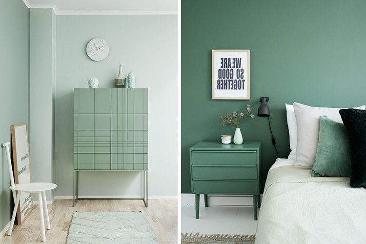
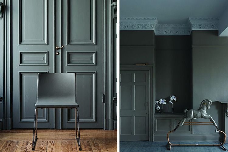
Mid-height
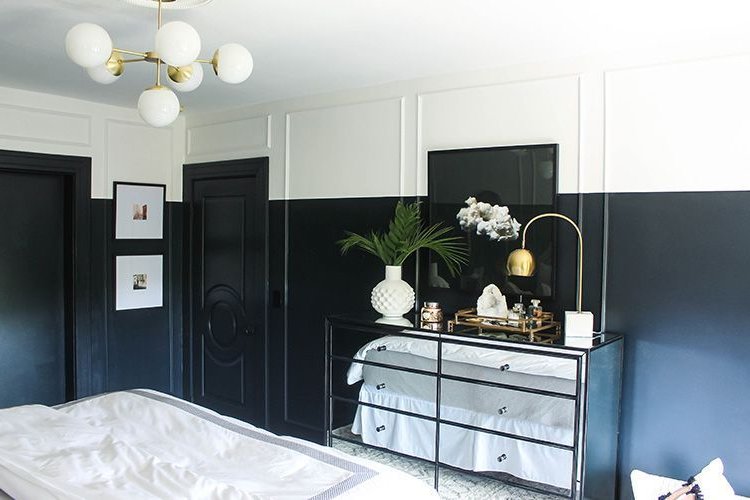
Another curious idea is to use two contrasting shades as a plinth (in these cases the darker shade usually goes underneath and the lighter shade on top).
This idea is not new; it has always been used especially in spaces with very high ceilings to create an optical effect of lowering the ceiling, but here the novelty is to do the same with the doors that you find on the way (cut included) to give homogeneity to the space.
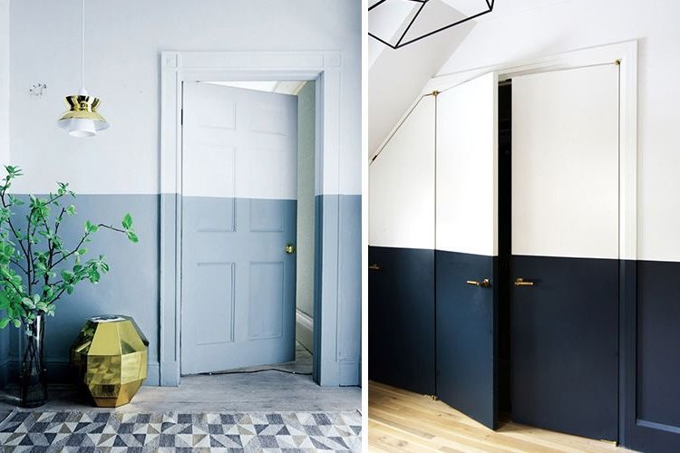
Of course, you can also paint the entire door in the same tone as the lower plinth of the wall, but the effect will no longer be the same: it loses a bit of originality (it is a more classic option of the most used) and causes a "cut" in the wall that makes the room look not so homogeneous.
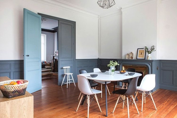
Scenic effects
At another level (more linked to stores, fair stands and others) very original effects can be achieved by mimicking the tone of walls and furniture. In some cases even simple figures can be painted on different levels and supports that optically appear to be complete.
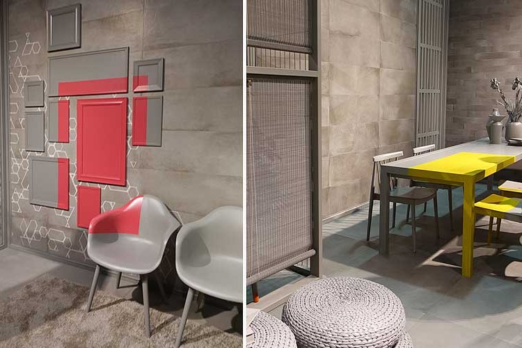
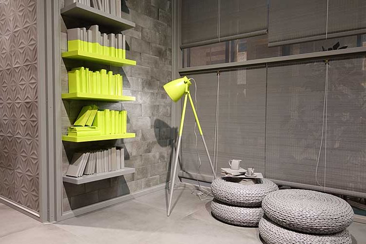
Anyway, the truth is that the possibilities of paint to decorate are endless, and if we try to turn the usual, we will surely surprise.
We leave you with more examples of wall and carpentry painting for your inspiration, and let's get painting!
