The meaning of colors in decoration
Among the many elements with which you can give your spaces a unique personality, the color palette is one of the most versatile resources. Colors in decoration play a key role, not only to dress walls, but to create compositions full of charm based on pieces of furniture and details of all kinds.
Knowing how to combine them wisely can make a big difference. But beyond the expertise in mixing them, did you know that each of them has a meaning and is capable of arousing different emotions?
From inspiring emotions to awakening ingenuity, maximizing spatial perception or luminosity, among others, there are many functions that colors fulfill in decoration.
What is known as color psychology has a practical application in the field of interior design. This discipline defends that each color awakens in us different effects, being able to associate different concepts and sensations to each shade.
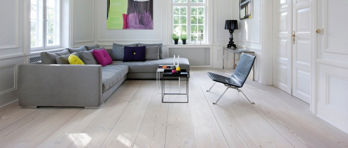
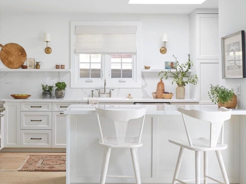
If there is a king of colors in decoration that is, without a doubt, white. Its versatility makes it a resource of enormous potential, not only to create attractive environments by themselves, but also to serve as a base for the introduction of other shades. Purity, cleanliness, peace? These are just some of the connotations associated with white spaces, an option that, beyond its aesthetic appeal, has great functionality.
Spaces dressed in this tone tend to be, in general, brighter. And not only that. In addition, it is a perfect color for small rooms or houses as it has the ability to multiply the feeling of spatial amplitude.
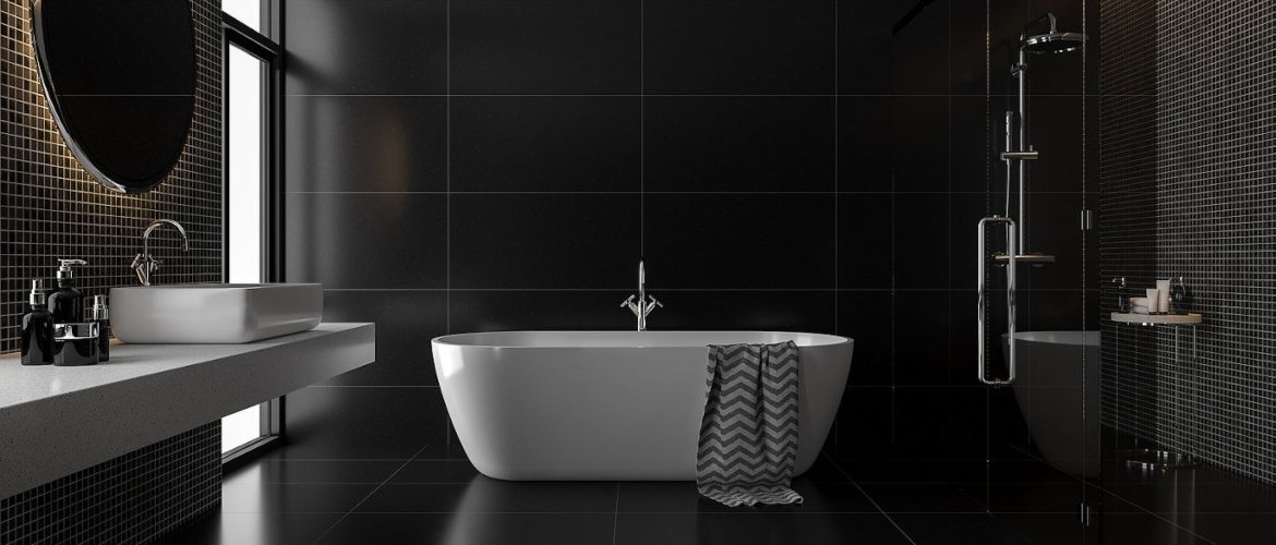
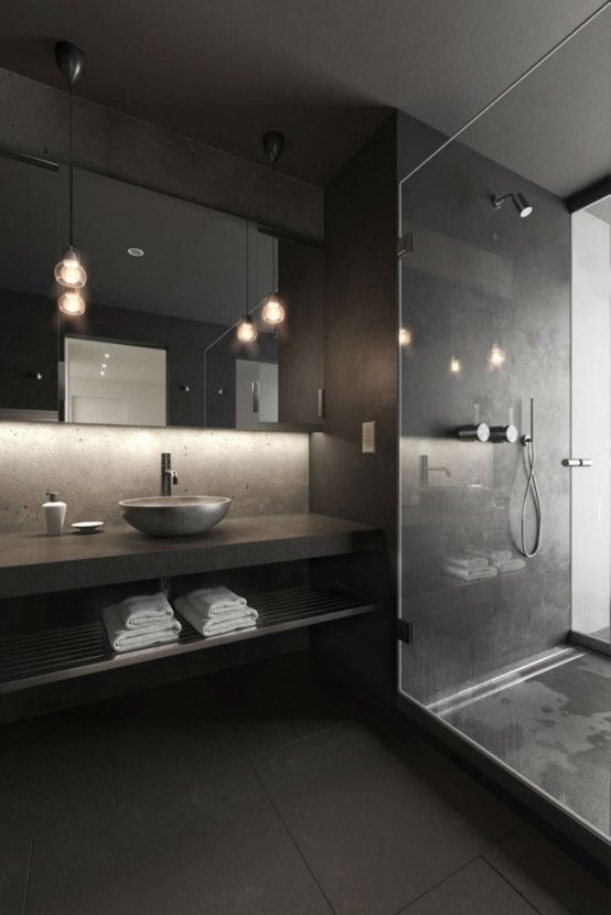
The opposite is true for the color black. Although it is true that it tends to dwarf spaces, in practice, it is also identified with security and elegance. This tone, which usually accompanies modern and minimalist interiors, brings seriousness to spaces, as well as a certain halo of mystery and even seduction.
For its contribution to live up to expectations, it is advisable to combine it with other chromatic counterpoints. The black and white binomial is infallible. However, it is also a good idea to introduce contrasts in intense colors such as red, yellow or orange. If you are looking to add a touch of warmth, you can always resort to wood.
Although black and white are two of the most popular choices, when it comes to colors in decoration it is interesting to introduce contrasts that give a unique character to the spaces.
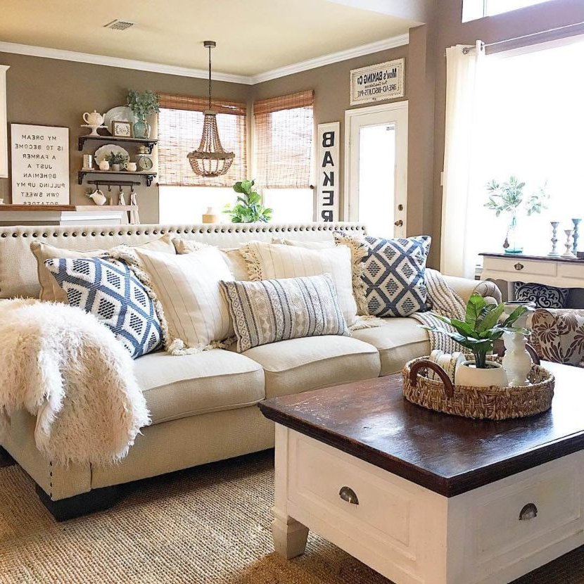
Within what is known as neutral colors, brown -in its different versions- is one of the most recurrent. Its main contribution to interior design is that it provides an unquestionable warmth, mainly related to relaxation and coziness.
Toasted walls, beige furniture, brown textiles... This is, undoubtedly, a color that denotes security and balance. So much so that it is perfect for the decoration of the day area - dining room and living room - but also for the bedrooms.
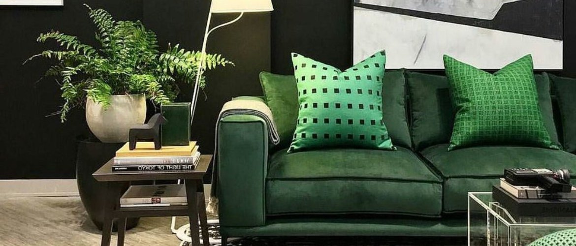
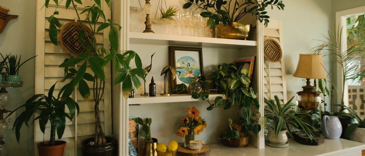
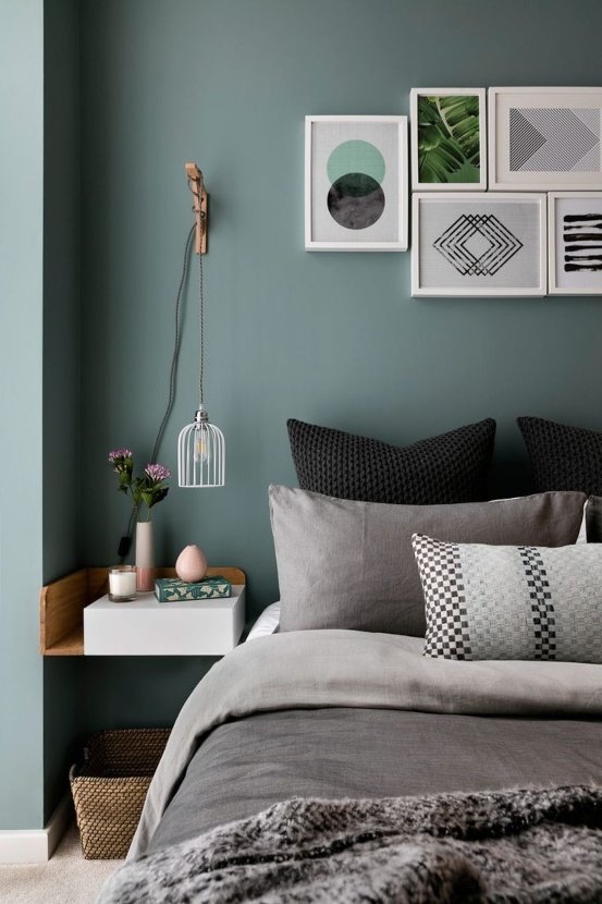
The chromatic palette hides the most interesting ranges for those who seek inspiration through colors. Green, for example, is a color linked to nature that, like brown, promotes balance. It adds touches of freshness and tranquility, promoting concentration and making it a perfect choice for the bedroom or office.
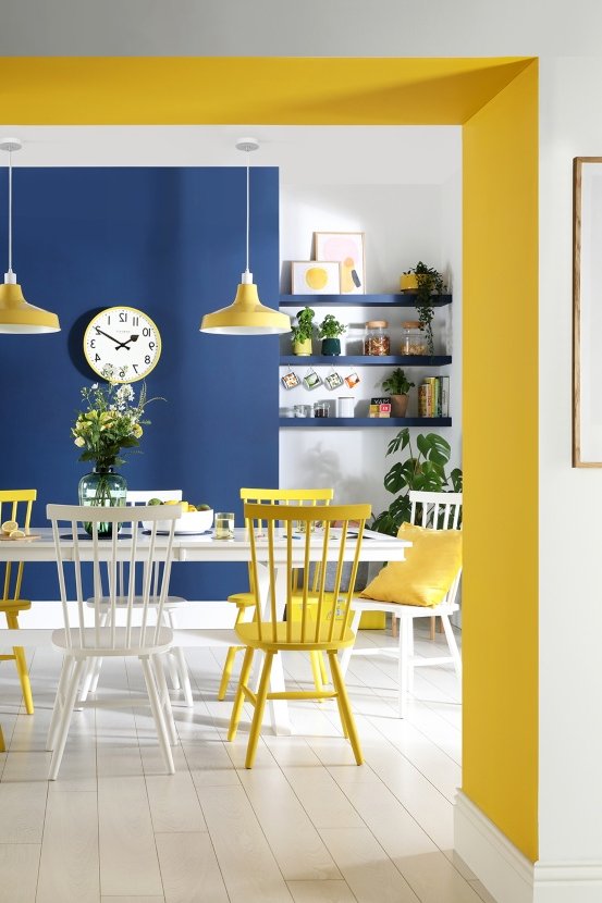
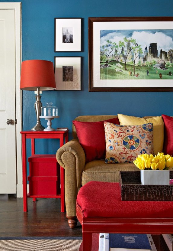
Something similar happens with blue, a tone traditionally related to relaxation. Its main contribution to decoration is that, regardless of its intensity, it inspires peace and confidence, making it a very interesting color for the bathroom, but also for the living room or bedroom.
But if what moves you is to find colors in decoration capable of awakening the senses for its vitality and energy, your range are warm colors. Yellow, for example, is a lively and cheerful tone that not only stimulates creativity, but also encourages optimism.
Any room in which it is present will become energizing, something you can also achieve with orange. But beware, because this color also whets the appetite so why not incorporate it into your kitchen decor?
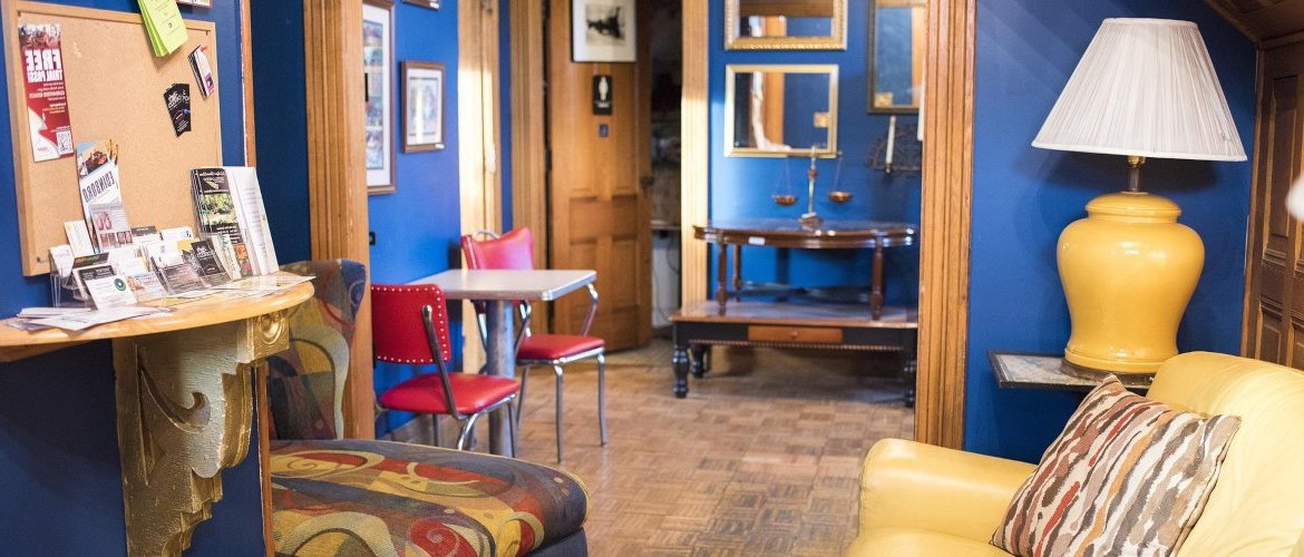
Red details are other resources that you can apply to achieve a positive effect on your mood. In addition to being identified with passion, this color reflects energy and vitality, although given its intensity, it should be incorporated with moderation.
The ideal? Do not combine more than three different colors and always follow the 60/30/10 rule or, in other words, apply the dominant color in greater proportion and reduce the presence of the rest depending on the role they play.
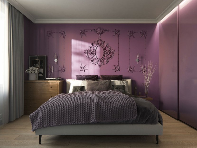
In contrast to the most classic shades, there are other lesser-known colors that, nevertheless, hide enormous potential. Purple, for example, is a color with multiple meanings in decoration. In general, it denotes elegance and sophistication or, in other words, it has traditionally been linked to nobility or luxury. However, it is also a color with a very spiritual dimension to which, in recent times, its identification with feminism has also been added.
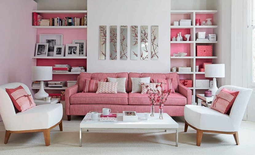
Its presence is perfect in bedrooms, a room in the house where pink also has a place. In this case, it is usually identified with innocence and delicacy, although, depending on its intensity, it can imprint more or less strength to the environments. Combined, for example, with white, it is an attractive option for living rooms that exude warmth and style.
What do you think of these contributions of colors in the decoration of the different rooms of the home?
 Lucy Bates
 - 1.1K views